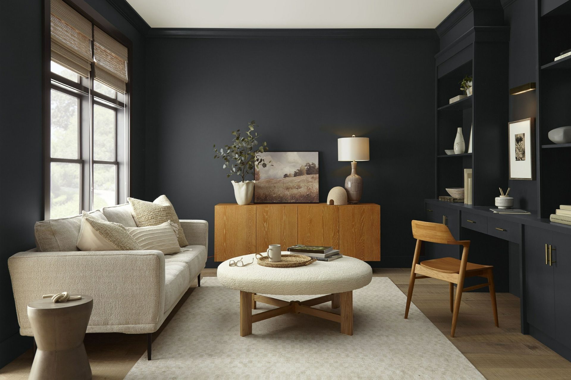
Contrasts exist in recent 2024 color-of-the-year selections from major paint and finish companies, now including Behr and Valspar, giving consumers more choice among recommended color trends.
Sherwin-Williams and HGTV earlier this week unveiled their collaborative color-of-the-year choice as soft, bright Persimmon, with paint in the shade already available at Lowe’s. Leading color guide Pantone earlier this year selected its bold formulation of Persimmon as its color of the year.
The Behr Paint Co. proclaimed Cracked Pepper (pictured above) to be its 2024 color of the year, declaring it a timeless and modern hue that awakens the senses and exudes confidence on every scale.
The company suggested that do-it-yourselfers and professional painters could incorporate Cracked Pepper into their projects to transform spaces by wrapping the walls in the color as a means of making a bold statement or adding it as an accent for a dollop of sophistication.
Behr offered some of the research that help the company arrive at Cracked Pepper as color of the year, including:
- 54% of U.S. residents say black tones in the home create a new energy and vibe
- 64% agree that black tones in the home make a space feel bold
- 57% say that painting a wall a dark or darker color gives the room a designer aesthetic
- 74% would consider painting an area or room a dark color
- 50% say a dark color treatment makes a room feel elevated
- 50% say dark color walls can create a sense of comfort in the home
- 61% of Millennials say black tones instantly give the home a fresh look
“As we look into 2024, creating a sense of comfort and belonging will continue to drive design decisions, but now, as life returns to its more familiar rhythms, it’s time to allow our senses to come alive,” says Erika Woelfel, Behr vice President of color and creative services. “From heightening the aromas of a dining room to feeling the softness of a living area, Cracked Pepper enhances the natural expression in any space.”
Of course, determining what colors will particularly excite consumers is both an art and a science, resting in part on application and situation but still subject to larger trends.
In a lighter, mellower approach, paint and coatings brand Valspar, in celebrating the 15th anniversary of its color of the year determination, announced it had selected Renew Blue as its 2024 pick.
Valspar characterizes the color as a balanced blue hue with a touch of grayed sea-green that signals wellness and comfort. As such, Renew Blue can establish a restful and meditative mood in any room of the home. The color choice emerges from Valspar’s observation that consumers are seeking consistency in their home and are working to find balance in their domestic spaces, the company noted. With a renewed focus on self-care and personal well-being, Valspar maintained, homeowners are seeking ways to make their dwellings uplifting places to relax, recharge and entertain.
“Renew Blue is an incredibly versatile and all-season shade that anyone can envision in their space,” said Sue Kim, Valspar director of color marketing. “Inspired by fleeting elements like fog, mist, clouds and glacier lakes, Renew Blue elevates the everyday mood, encourages self-expression, and evokes a feeling of balance and calm, with a twist of unique spontaneity. Blue is a classic shade that has become the new neutral for today’s home and can be mixed and matched to fit a variety of design styles and applications.”


