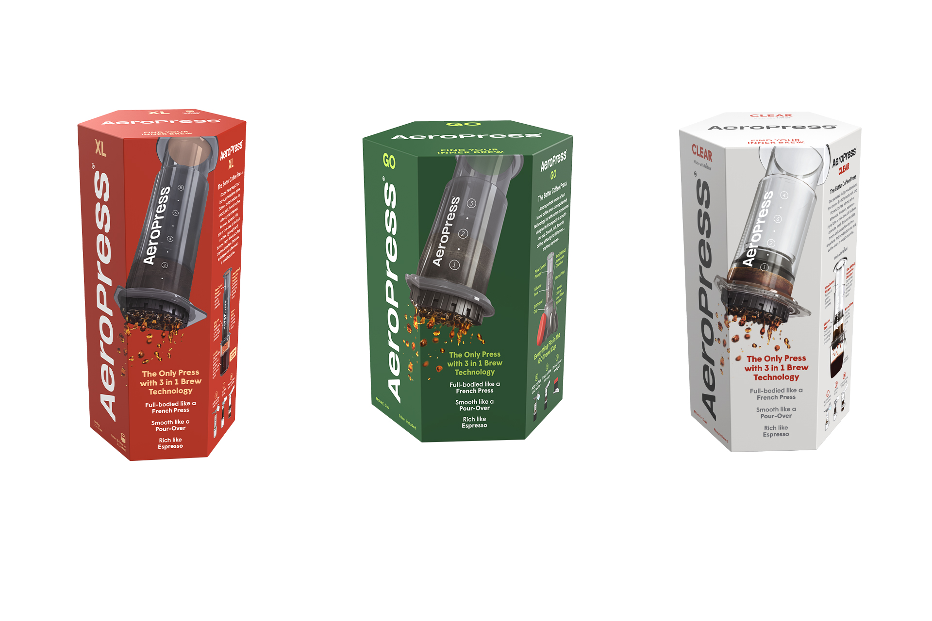
AeroPress has unveiled a brand and packaging refresh for its coffee brewers that retains the brand’s hexagonal-shaped box but utilizes bold colors to help the products stand out more on store shelves and signify each product’s ethos.
Honoring the past while ushering in a new era, the new colors are designed to bring emotion and impact to the look and feel of the packaging, said AeroPress, and to help the brewers stand out on the shelves. The core product line that includes AeroPress Original, AeroPress XL, all filters, AeroPress Carafe and AeroPress Organizer will feature red that signifies the brand’s passion for coffee. The AeroPress Clear model is packaged in silver-gray, designed to visually communicate its benefits as a coffee press sleek enough for display but tough enough for the road. The AeroPress Go model features green packaging inspired by the great outdoors, emulating its portability and suitability for adventure-loving consumers.
AeroPress worked with OffWhite Co. — whose clients include Coca-Cola, Chobani and Michael Jordan — on the brand refresh. Along with new colors, AeroPress changed the font of its logo to Wigrum, which OffWhite described as premium, readable, approachable, durable and solid.


