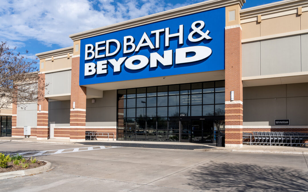
Bed Bath & Beyond is in the midst of major changes, with store merchandising among the areas of focus as it works to reconfigure the entire approach to the customer by integrating private labels and national brands while consolidating online and in-store shopping.
Bed Bath & Beyond’s reinvention comes in concert with a new CEO, Mark Tritton, whose background includes stints at Target as well as Nordstrom, Timberland and Nike. He has built an executive team with broad and deep retail experience including John Hartmann, evp, COO and president of the buybuy BABY banner and former CEO of True Value Co.; Cindy Davis, evp, chief brand officer and president of the Decorist operation and former L Brands evp and chief digital marketing officer; and Joe Hartsig, evp, chief merchandising officer and president, Harmon Stores and former svp and chief merchandising officer at Walgreens.
New Flagship Sets Sail
Under that leadership, a transformed Bed, Bath & Beyond merchandising program has launched, one the company showed off at the opening of its new flagship store in New York City. The remodel of an existing location in Manhattan’s Chelsea community, the 92,000-square-foot store doesn’t feature the deep bays that have been typical of Bed Bath & Beyond stores, nor are products merchandised in the middle of a racetrack traffic pattern surrounded by pile-it-high displays.
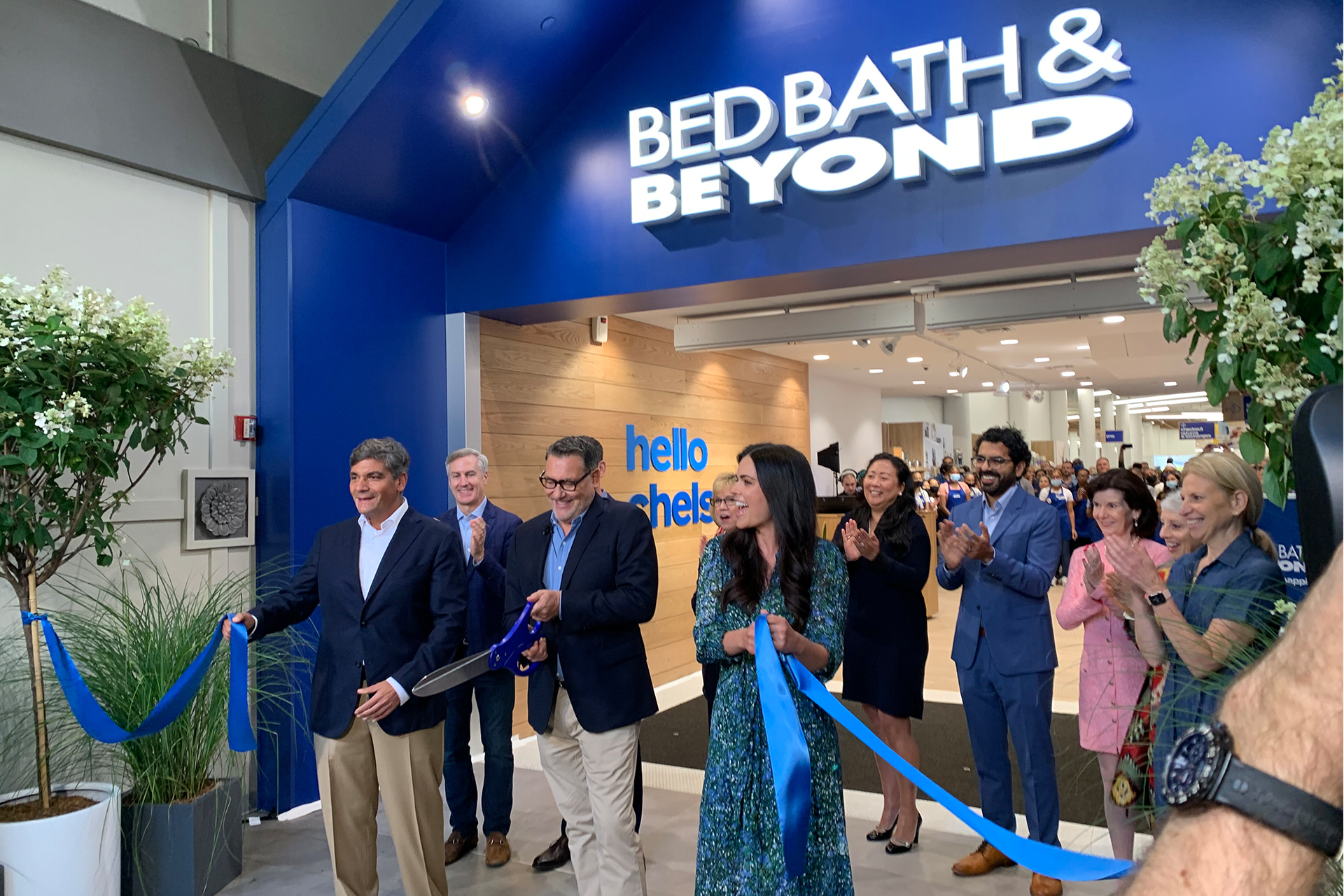
Rather, low fixtures provide clear sightlines through the Chelsea store where a main path through the sales floor ushers people past departments that are identified by type and function. Although a lot bigger than the typical Bed Bath & Beyond store, the basic merchandising approach evident in the Chelsea location already prevails in 150 of 450 stores the retailer has slated for its initial remodeling initiative.
Even as it prepared to launch its flagship store, Bed, Bath & Beyond busied itself with another critical initiative, the rollout of a series of new “owned brands,” as the retailer likes to call its proprietary labels.
Blending The Brands
Cindy Davis told HomePage News
at the flagship store opening that “blending” is key to how new Bed, Bath & Beyond merchandising addresses and entices the shopper.
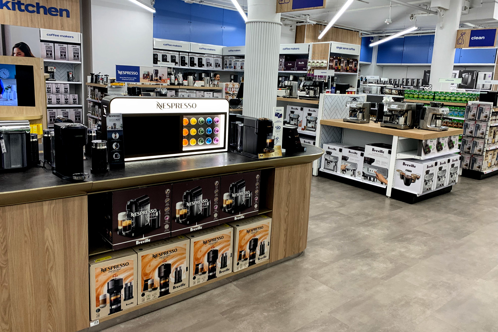
In the store, taking kitchen products as an example, a brand wall of featured products rises behind the on-floor displays. In the layout, Bed, Bath & Beyond combines national and owned brands, including proprietary Our Table items, to provide the shopper with choice across a wide price/value spectrum
“You can see on the back wall how we blended KitchenAid, Our Table, Le Creuset, Breville,” Davis said. “Our stated goal is to have 30% of sales be owned brands. So, as you’re going through the store, you should see a blend. Look for Our Table, In Kitchen and Simply Essential, and how we blend with powerful national brands. In the organizational area, you see Squared Away, which is our brand new organizational brand, sitting beside some Oxo and iDesign.”
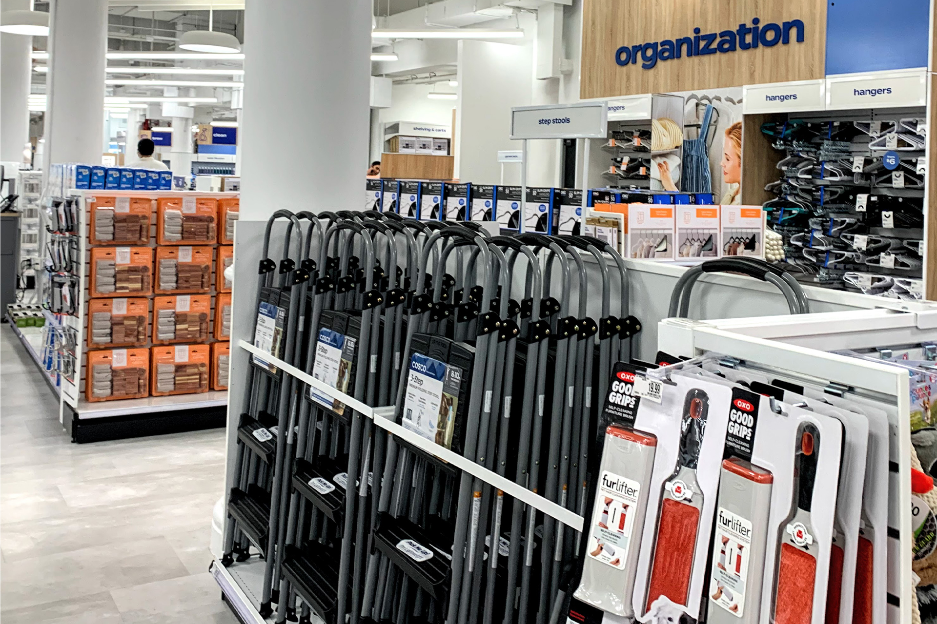
Starting with the Simply Essential proprietary label, Bed, Bath & Beyond has mixed and matched owned and national brands and price points in an array that appeals to value but also offers premium quality. Not only does that assure that most shoppers can find products they can readily afford, it establishes Bed, Bath & Beyond as a destination for better and aspirational brands, such as KitchenAid, which may not be affordable to some customers at a certain point in their lives but may be later. The merchandising has appeal across budgets and time, according to the retailer.
The Human Touch
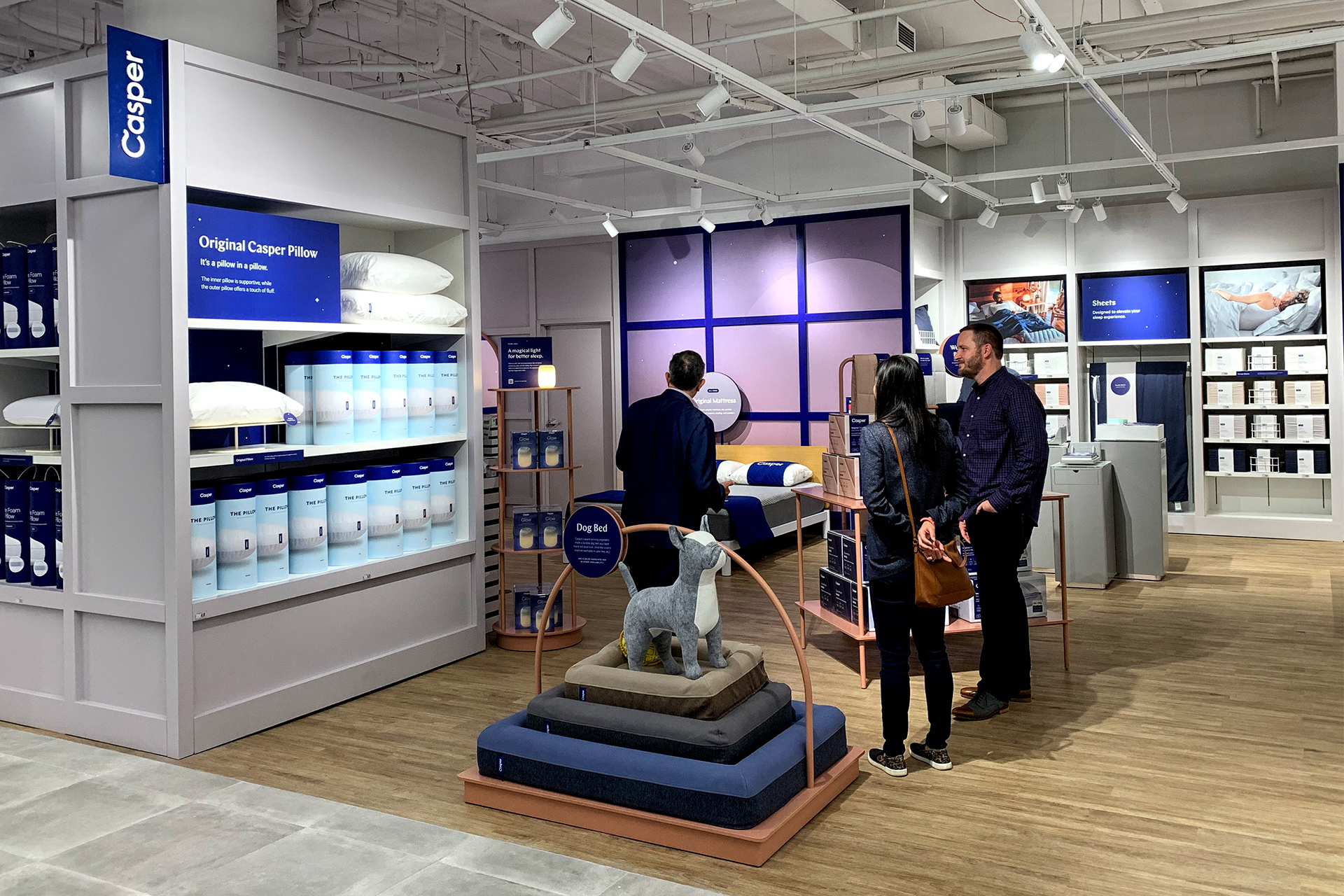
Lifestyle graphics supplement and add the human touch to departmental signage. For example, the “Power Up!” graphic of a woman working grabs the eye and helps redirect it to a cross-aisle display of featured electrics, including heating and cooling products, that gets an extra kick from a presentation of Google Nest products. Similarly, the sleep shop combines owned brand products including Simply Essential and Wild Sage with licensed Ugg items and a dedicated Casper display.
The long sightlines and bright interior of the reconstituted sales floor highlight the national and owned brand blend in an arrangement that creates a broad and open scene storewide. The entire presentation, from paint color to lighting to lifestyle signage is a combination designed to make shopping easy on customers.
Feature presentations have a comfortable sensibility. The Casper nook in the sleep shop has a bedroom-style arrangement rather than an open-floor or bay-display setting, which would be the case in more traditional Bed Bath & Beyond stores. Throughout the Chelsea location, owned brands and other labels have significant displays assembled in a manner that builds into whole department presentations instead of separating singular brand sets, even as Google Nest, Casper and SodaStream, with its BubleCafe, get spotlights.
“The merchandising transformation is remarkable,” Hartmann said.
The presentations have their particular eye-catching features in the context of the larger store and speak to the range of choice available in national labels complemented by owned brands.
“Whether it’s Simply Essential, Our Table, it just provides the customer a full array of really excellent curated assortments we never had before,” Hartmann added.
No longer heavily laden with often undifferentiated merchandise, the remodeled location is an open, airy place to shop.
“Omni-Always”
The remodel also spotlights the retailer’s amplified omnichannel factor — or “omni-always” factor in the new Bed Bath & Beyond parlance.
The omnichannel element confronts shoppers as they walk into the Chelsea store, in which the online sales pickup counter is just off the entrance and adjacent to the lead kitchen shop and checkout stands. Curbside pickup is available as well. Store visitors can access self-checkout and QR codes that link to the company’s website to provide color and other variations of in-store products, comparable items, complementary goods and Bed Bath & Beyond services.
Go to the app, you can scan any product, you can put it in your basket, you can check out with your app. So we’ve really gone fully digital.
-John Hartmann, EVP, COO and President of the buybuy BABY banner
“Go to the app, you can scan any product, you can put it in your basket, you can check out with your app,” Hartmann said. “So we’ve really gone fully digital.”
The retailer’s app facilitates the use of all the in-store links, Hartmann pointed out.
All new features at the Chelsea flagship play into the larger store and brand remodeling effort by Bed Bath & Beyond.
Chelsea, in its size, scale and occupation of an old-school New York building, with its imposing columns and two-level sales floor, might have its differences from other Bed Bath & Beyond stores, but, as Tritton said in opening the location, “It’s a blueprint for the rest of our fleet.”

