As stores and services continue to evolve, so must retail design and its techniques, visual merchandising expert Anne Kong said during her Connect FALL session, “Enhancing Your Visual Toolbox.”
Kong is professor and program coordinator, Spatial Experience Design Program, Fashion Institute of Technology, and partner in A+D Kong.
Kong first discussed the concept of spatial design, which takes a wider look at the combination of the store’s architecture, exterior landscape, faćade, window displays and public art, along with the interior design of the store, its products, services and store experiences. In spatial design, retailers can communicate with customers through product presentation, product identification, furnishings as fixturing, incorporating hospitality, residential-style lighting and environmental graphics. All of these techniques can catch the eye of the shopper. Retailers need to look at how all the parts come together as a whole to make the store a destination, Kong said. Balance, contrast, alignment, positive/negative space, value, weight, position, communication and texture all play a role.
“What is in your visual toolbox?” Kong asked, before sharing examples of techniques and storefronts that illustrate them.
Abstract Mix
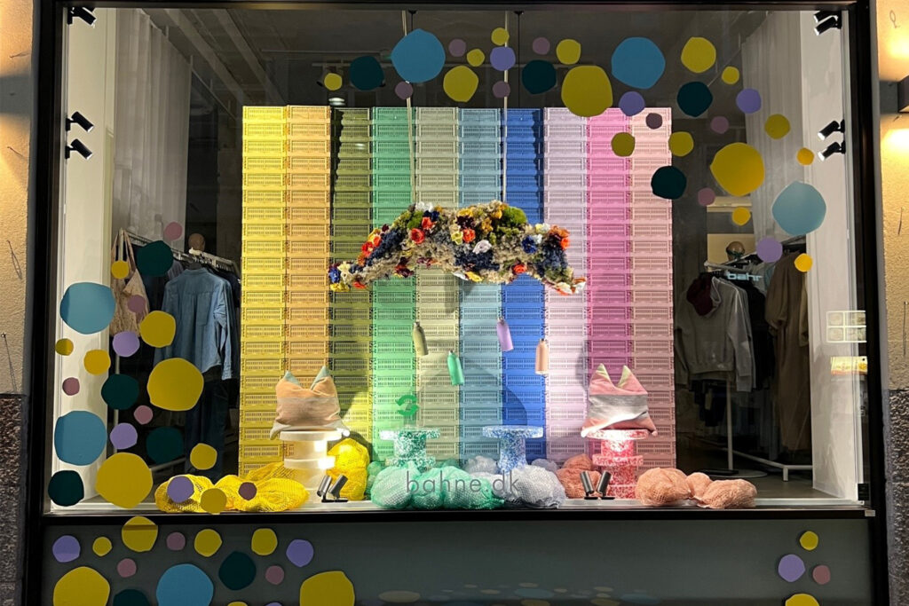
Abstract Mix can make some designers uncomfortable, Kong said. It asks the designer or retailer to draw outside the lines a little, but in turn, it will cause a viewer to look twice. In this example from gia Top Window global honoree, Bahne in Denmark, floating merchandise, horizontal lines and an abstract flower “cloud” draw attention but lighting keeps the focus on what is important as far as merchandise.
Color
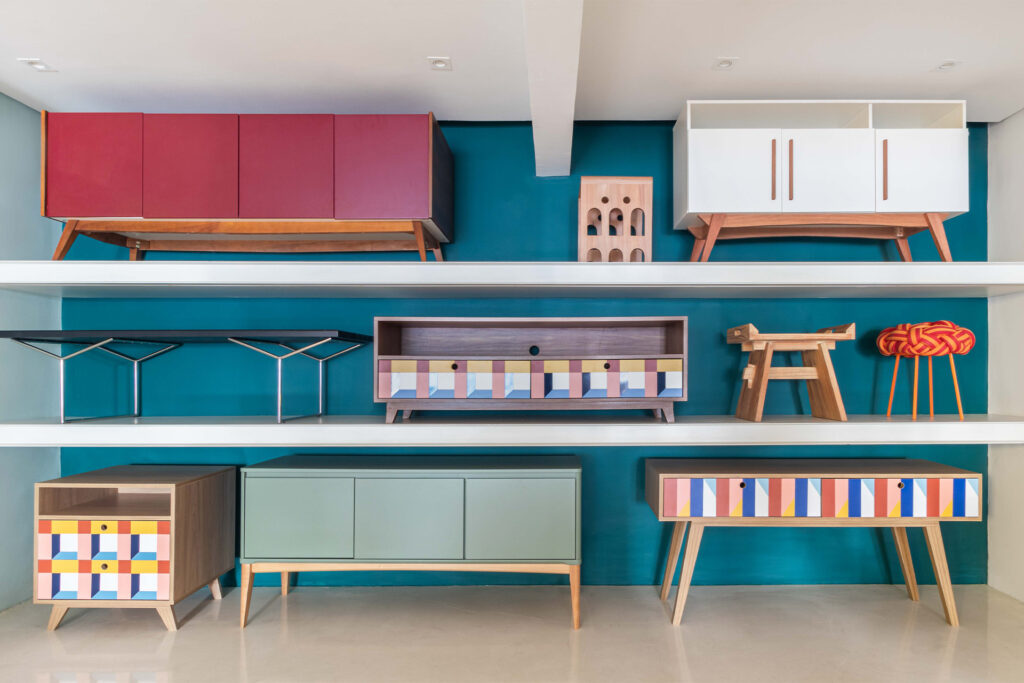
While it can be seen as a commitment on a selling floor, color can open up tight spaces to expand them naturally and draws shopper to the back of the store, Kong stated, sharing an example of Muma in Brazil.
Monochromatic
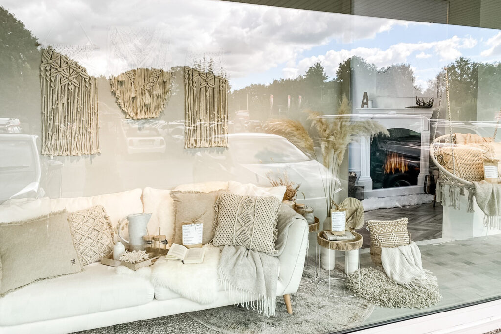
Monochromatic looks can be a phenomenon or spectacle for the viewer. It has the power to stop the eye of the viewer to make them search for differences. It can take a lot of time to curate, but the viewer will also spend a lot of time taking in the presentation. Kong noted the use of texture in this example from Buss Wohnen in Germany.
Texture
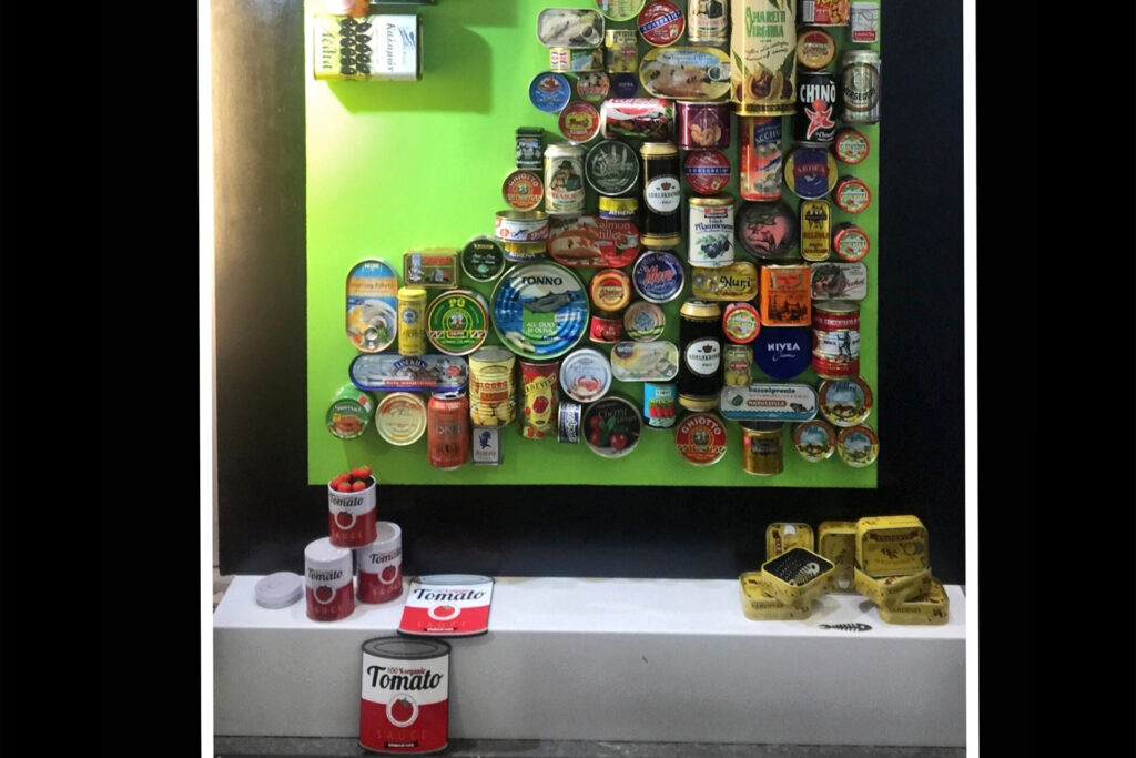
Texture can be very appealing to viewers, Kong stated, showcasing an example from Fontana in Italy. The strong diagonal line of recycled cans draws the eye to the merchandise, she said.
Call to Action
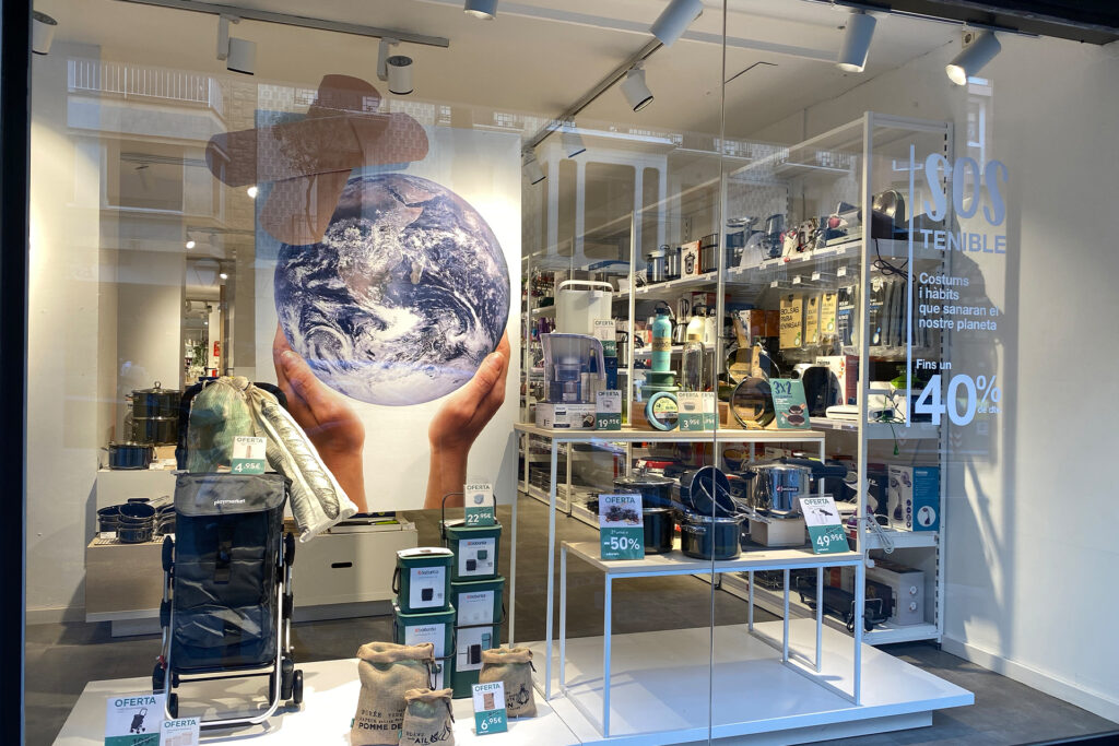
Retailers can use the call to action technique to raise awareness about a cause that is important to them. In turn, this can connect the retailer to the customer who aligns with their values. In this example from Culinarium in Spain, the lighting focuses attention to the merchandise very clearly, but call to action has a presence.
Museum
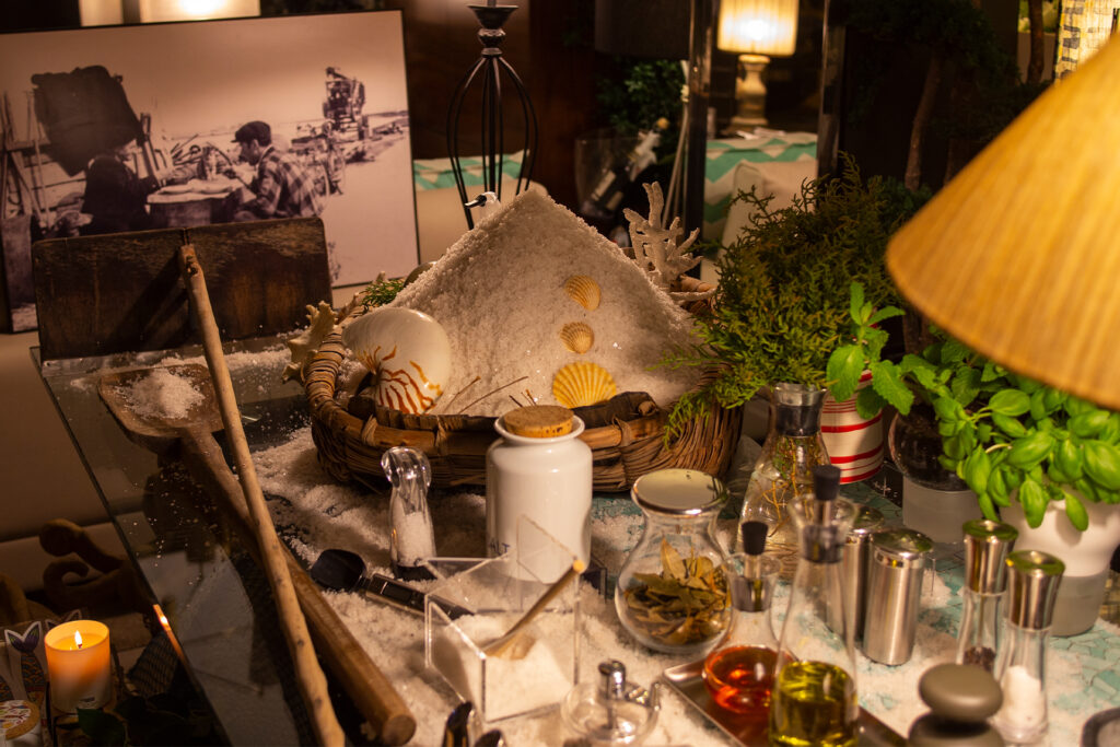
Museum refers to using history to showcase the products in the real world while reflecting back in time. In this example from gia Top Window honoree, Habitare – Loja & Atelier in Portugal, salt in the storefront harkens to local history and the salt mines in the town.
Surprise
This technique equates surprise with rewarding the customer visually. Monotonous lines are familiar and help the customer navigate, but the visual monotony is broken up with a surprise like a pop of color, Kong said.
Fantasy
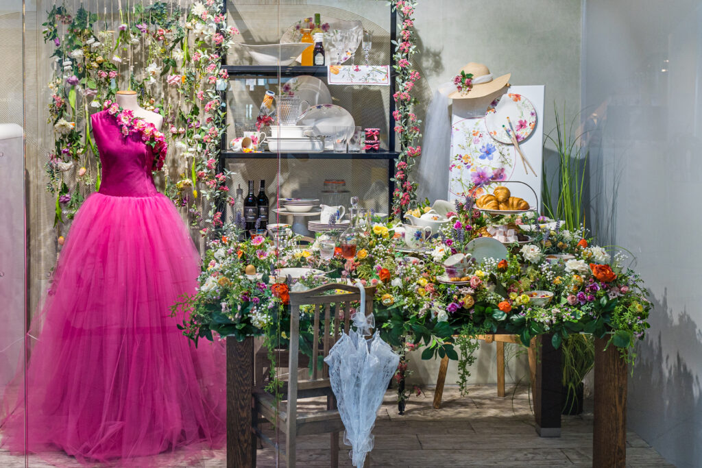
In the fantasy technique, the display is a feast for the eyes, a fantasy that takes away from the real world and makes the windows feel like theater. In this example from Premium Home in Poland, the merchandise is displayed as though in a painting.
Current Events
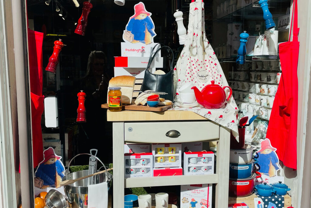
Current events refers to bringing local or national events into the display in the window. Kong used this example from The Cookshop in the UK, which referenced a recent skit with Queen Elizabeth and Paddington Bear.
Surrealism
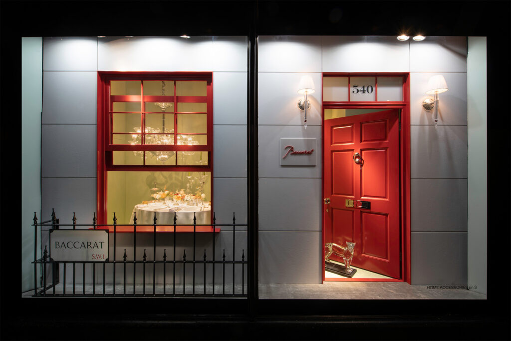
Surrealism borders on the abstract, but it is more reminiscent of real life, said Kong, showcasing an example from gia Top Window honoree, Harrods in the UK. Harrods turned the window of the store into a residence that became the framework for merchandise, turning the shopper into a voyeur peeking into the window.
Lifestyle
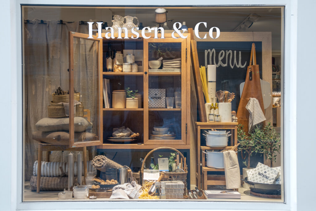
A lifestyle window uses the products in a way where merchandise feels deliberately placed or curated. This example from Hanson & Co in Norway uses texture and visual followthrough for the eye to travel around the display.
Symmetry
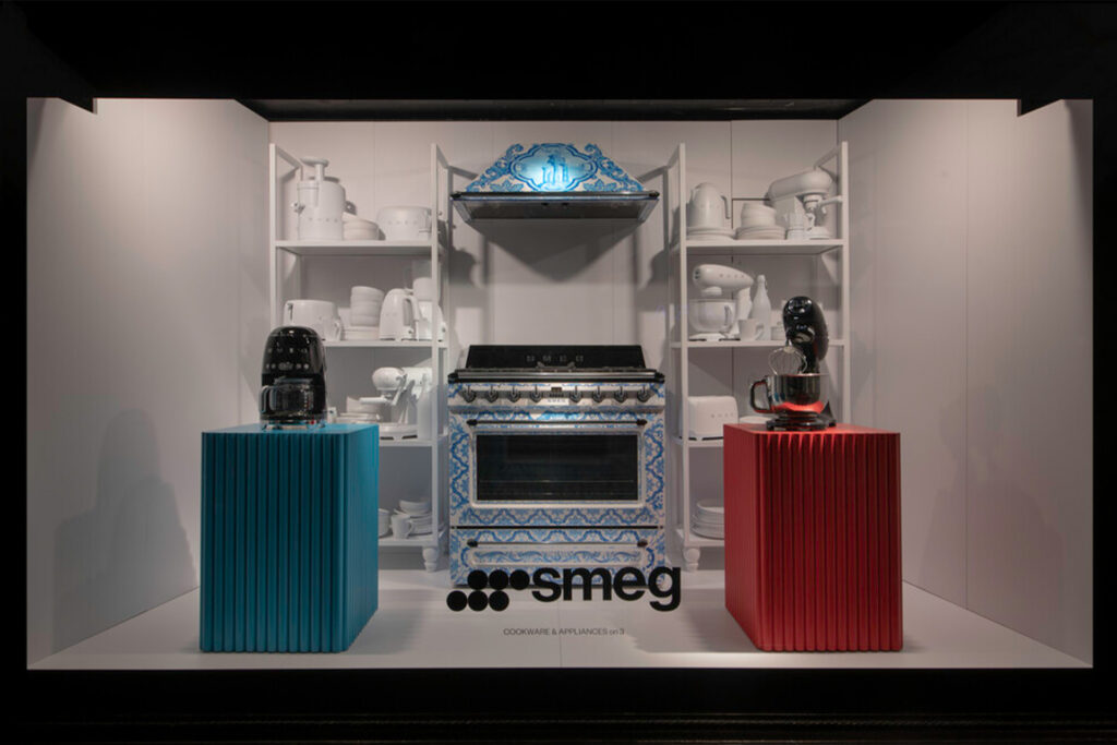
Symmetry refers to the mirroring of a space on both sides of the display. Kong showed an example from Harrods in the UK using symmetrical product displays to surround a colorful stove.
Juxtaposition
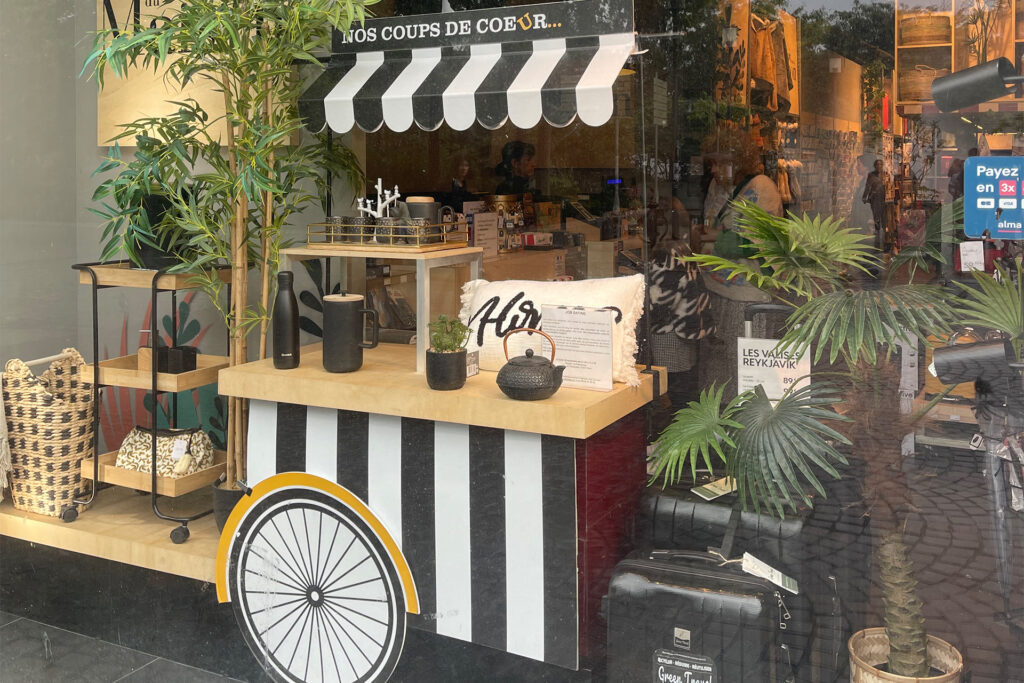
This is a visual contrast between objects that we see in the window, said Kong, a juxtaposition of something ordinary with something extraordinary. For example, seeing something that doesn’t belong there. In this example from Du Bruit dans La Maison in France, the cart acts as a prop to grab attention and bring in the viewer.
Tagline
“Don’t underestimate the power of copy and how we can talk directly to the consumer,” asserted Kong. Taglines can be tongue and cheek and provoke in a positive way. For example, in Bloomingdale’s in NYC, a “roll with it” neon sign is a playful way to showcase the rolling pins and other cookware and appliances.
Whimsey
Also in Bloomingdale’s in NYC, a neon sign saying “whisk me away” is a conversational tagline that evokes whimsey and is used to promote whisks.
Graphics
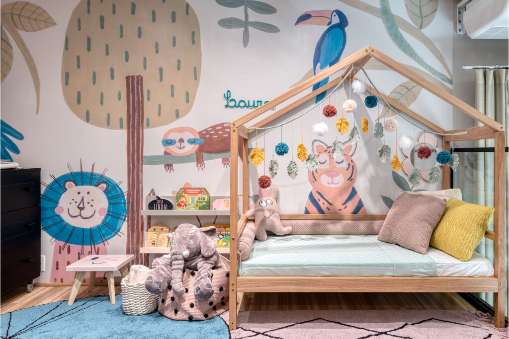
Graphics can set the stage and give off an aura when part of the display, Kong said, showing this example of graphic wallpaper from Minihaus in Brazil.
Nostalgia
This generation of shopper loves the idea of vintage, expressed Kong. A nostalgic display using the contrast of vintage items and modern gadgets can make the consumer stop and reflect for a moment.
Education
“Sometimes we forget that we have a superpower as visual merchandisers,” Kong said, discussing the education technique. Retailers can talk to their shoppers using many methods, such as informative lists or tips as part of the display.
Kong offered a few last pieces of advice in response to questions. She stated that right now, a more robust display is important to the consumer; if they are coming out of their houses to shop, they want to be entertained. She also said that windows should be changed roughly every two weeks. When it comes to online merchandising changing as often as the windows, Kong said she doesn’t think it is necessary but that seasonal changes should be reflected.
Kong relayed how important it is for retailers to have moments of value. Certain areas in shopping environments have the power to guide the thoughts, behaviors and habits of the customers. “If we have our customers come to our stores, we have to reward them with good service and reward them visually,” she said.

